Editing stage, Ive used ‘Adobe Lightroom & Adobe Photoshop’. As I find Adobe Lightroom easier to use, as it has that option of scanning through you’re images and rating them which defines you’re selection and helps you choose you’re favourite. Also in Adobe Lightroom I alternated the colours, to present more contrast and clarity to make that shot more influential and effective.
From there in Adobe Photoshop I staggered more with the contrast and clarity also tones vibrance and saturation. To give that old, gritty and high contrasted feel to them. Making the tones create that defined look and making the details stand out much more. My selection of Images worked so much better in black and white than in colour as it defines the subject matter and strongly emphasises the emotion being portrayed in the images.
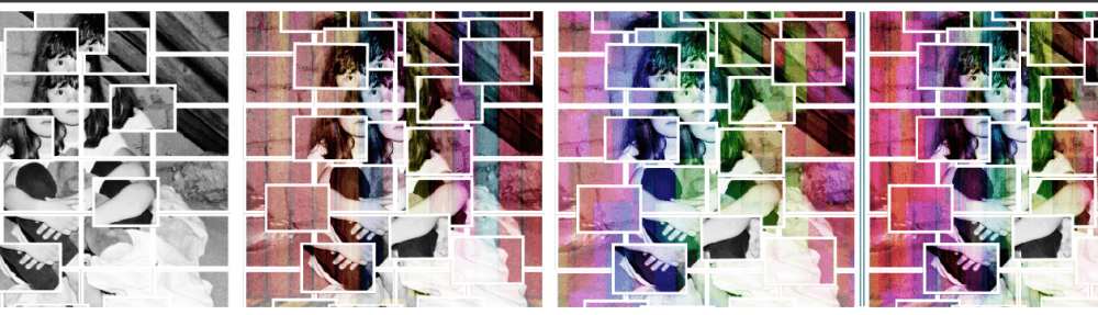
In my prints I have used a photomontage technique which is influenced by photographer ‘David Hockney’ (discussed in research). To produce this method I used Adobe Photoshop, to break down sections of the Image – I made layers on layers and duplicated segments to make that overlaying result, Using the ‘Rectangular Marquee Tool’. Over the parts I wanted to duplicate. To get each square the same size, I used the Grid tool to help me position each square. >>> A few examples of my progress with messing around in photoshop, trying to get a better and more successful finish piece. >>>

After deciding on the variety of techniques and outcomes. I then started thinking about colours and developing more effects and possibilities. – Within photoshop I collected patterns, colours ect, (sourced from google) which I could calibrate into my piece to make it more competent. – The colours would represent the hope which the child has. Which deliberately highlights the key aspects of the child’s features. Having bright colours and patterns over these features would bring the audience more involved and intrigued by the strong awareness of the recent problems which have been witnessed in the U.K, regarding money.
Adding the colours into photoshop. – I added the colours on different layers and duplicated as many as I needed. And resized them so they fitted in each square. I have used different colours and patters so it didn’t look to similar. Which I personally think worked well. I also experimented with adding one select colour over the whole piece. But in my opinion I didn’t think it looked as strong, as you couldn’t see that defined detail, the colours took over to much. >>> Few examples of colour prints >>>


I personally thought it worked better with only a few colour sections in the shot and not fully coloured. So I decided to choose 8 squares which personally represents the key aspects of the childs face. I decided on 8 as it’s an even number, and it would’t of looked suitable if I choose an odd number. Or any less as it would be pointless having any colour involved. >>> Final decision on colour >>>
